
Date: College Freshman, August, 2010
Materials: Crayola Colored Pencil
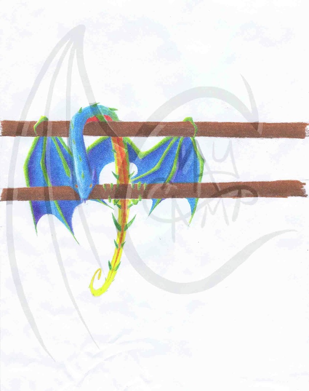
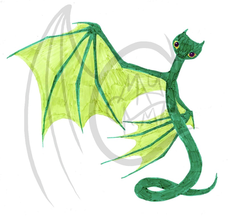
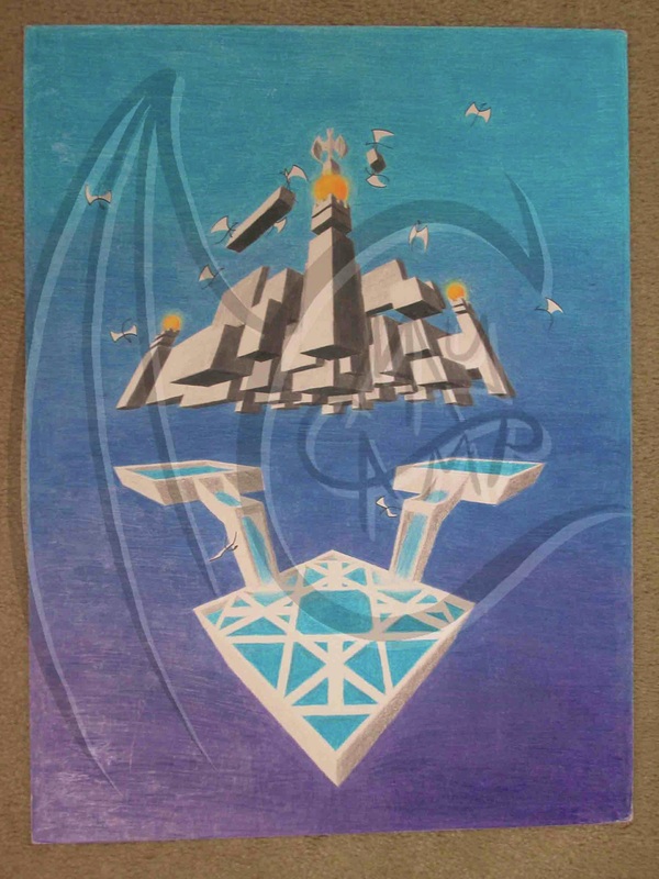
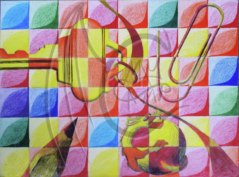
After seeing my dad’s friend’s bird, I was inspired to draw a dragon that was more bird-like. This one is colored!
Materials: Crayola Colored Pencil
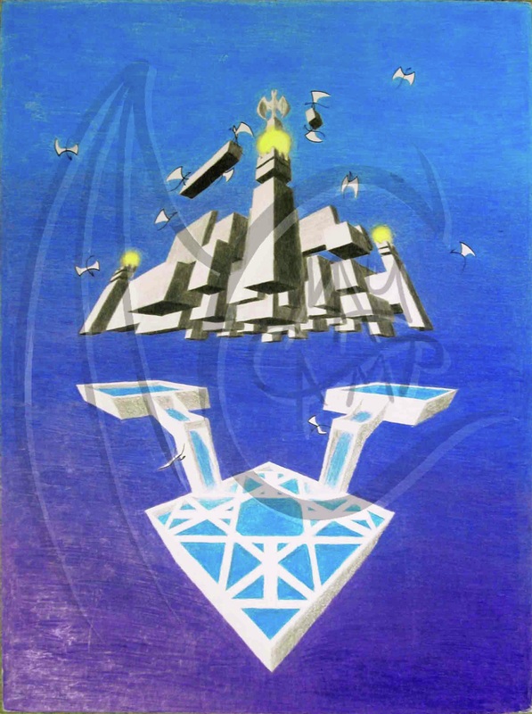
After seeing my dad’s friend’s bird, I was inspired to draw a dragon that was more bird-like. This one is colored!
 RSS Feed
